Designing A Vintage Mascot Logo
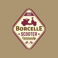
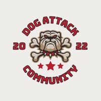
A vintage mascot logo is a design that incorporates elements from the past, such as classic typography, timeless colors, and retro illustrations. To create a vintage mascot logo, you may choose to use vintage elements that are relevant to the character or brand being represented. You may also want to incorporate elements of nostalgia, such as old-fashioned illustrations, distressed textures, or a monochromatic color palette. The goal is to evoke a sense of history and timelessness, while still being eye-catching and memorable. When designing a vintage mascot logo, it’s important to consider the intended use, such as on clothing or promotional materials, and to make sure the design is easily recognizable and scalable.


Vintage Logo For Business
A vintage logo is a logo design that has a timeless, classic, and nostalgic look and feel, often inspired by the design styles of a specific historical period, such as the 1950s or 1960s.
Vintage logos are often characterized by the use of classic typography, muted colors, and simple graphics, such as badges, emblems, or illustrated elements. They often evoke a sense of tradition, quality, and timelessness, and are used to create a distinctive and memorable brand image.
Vintage logos can be used in a variety of industries, including fashion, food and beverage, travel and tourism, and more. They can also be used to create a retro or nostalgic look and feel for a brand, helping to differentiate it from its competitors and appeal to a particular target audience.
However, it is important to use vintage logos in a way that is relevant and appropriate for the brand and its target audience, and to avoid creating a logo that is simply an imitation of a historical design style. A successful vintage logo should balance a classic look and feel with a modern sensibility and relevance to the brand and its audience.


Why Vintage Logo is Different From Other Logos
A vintage logo is different from a normal logo in several ways:
Style: A vintage logo is characterized by a classic and timeless look, often inspired by a specific historical period, while a normal logo is designed to be contemporary and relevant to the present day.
Typography: Vintage logos often use classic typography styles, such as serif fonts, while normal logos may use more modern and sans-serif fonts.
Colors: Vintage logos tend to use muted and subtle color palettes, such as earth tones or pastel shades, while normal logos may use bolder and more vibrant colors.
Graphics: Vintage logos often feature simple and elegant graphics, such as badges, emblems, or illustrations, while normal logos may use more complex and abstract graphics.
Purpose: Vintage logos are used to evoke a sense of tradition, quality, and timelessness, while normal logos are designed to communicate the brand’s values, personality, and mission in a contemporary and relevant way.
In summary, while both vintage and normal logos serve the purpose of identifying and representing a brand, they differ in style, design elements, and the emotions they evoke. The choice between a vintage or a normal logo will depend on the brand’s history, values, and target audience, and the desired look and feel of the brand image.


Turning Vintage Logo Into a Mascot Logo
A vintage logo is different from a normal logo in several ways:
Style: A vintage logo is characterized by a classic and timeless look, often inspired by a specific historical period, while a normal logo is designed to be contemporary and relevant to the present day.
Typography: Vintage logos often use classic typography styles, such as serif fonts, while normal logos may use more modern and sans-serif fonts.
Colors: Vintage logos tend to use muted and subtle color palettes, such as earth tones or pastel shades, while normal logos may use bolder and more vibrant colors.
Graphics: Vintage logos often feature simple and elegant graphics, such as badges, emblems, or illustrations, while normal logos may use more complex and abstract graphics.
Purpose: Vintage logos are used to evoke a sense of tradition, quality, and timelessness, while normal logos are designed to communicate the brand’s values, personality, and mission in a contemporary and relevant way.
In summary, while both vintage and normal logos serve the purpose of identifying and representing a brand, they differ in style, design elements, and the emotions they evoke. The choice between a vintage or a normal logo will depend on the brand’s history, values, and target audience, and the desired look and feel of the brand image.
